
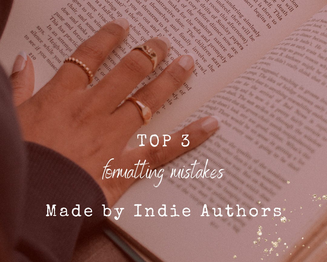
Top 3 Formatting Mistakes
Made by Indie Authors

As a self-published author, your book is in competition with over 2.6 million other self-published books. Your book will appears alongside more than 560,000 traditionally published books. When I talk about traditional publishers, I mainly refer to “Big 5” publishing conglomerates (Penguin Random House, HarperCollins, Simon & Schuster, Hachette Book Group, and Macmillan) that have been around long enough to set the standards for formatting books in the publishing industry.
Self-publishing is a tough business. Not only do you have to write your socks off to create the next great Canadian novel, but to compete with the Big 5, you must also format your interior to industry standards. The best way to do this is to use software like InDesign or Canva. Sit down with a Big 5 traditionally published book, and make your interior look exactly the same.
Here are the top three formatting mistakes made by indie authors. Avoiding these mistakes will help your book stand the test of time alongside books published by traditional publishing houses, including the Big 5.
1. Spacing and indents and formatting
Break down the formatting of any traditionally published book, and you will see evenly spaced paragraphs. That means there is no additional space between paragraphs in the manuscript. Instead, indents indicate the start of a new paragraph. Using an extra line between paragraphs and/or omitting the indent is a surefire way of showing the world that your interior formatter is unfamiliar with industry conventions.
Formatting for the first paragraph in a chapter or chapter section should begin at the left margin. Insert an extra line between section breaks. Use a symbol (like an asterisk or series of asterisks) to show section breaks that begin at the beginning or end of a page.
Set your paragraph alignment to “Justified” for even left and right margins. Outside page margins should be formatted to between 0.75–1”. Top, bottom, and inside margins (near the spine) should be slightly larger (1–1.25”). This is to accommodate the author’s name and book title at the top of the page, the page number at the bottom of the page, and near the spine to prevent text from disappearing into the binding.
2. Overuse of italics/bold/underline when formatting
Most style and formatting guides (CMOS, APA, MLA, etc.) agree that italics should be used for emphasis. Bolded text should be reserved for titles and subtitles. The Chicago Manual of Style (CMOS) is most frequently used for fiction these days, so I will defer to that. According to CMOS, though underlining or boldface may occasionally be used for emphasis, “italics are the traditional choice.” It goes on to say, “bold text for emphasis risks appearing too emphatic . . . whereas underlining may conflict with the style used for hyperlinks and, on edited manuscripts, with tracked changes.”
Be mindful of where and when you use italics; any technique loses its effectiveness when overused.
In addition to emphasis, use italics when formatting characters’ interior monologues. Take care to use italics sparingly when using a deep point of view, where the entirety of the manuscript represents the characters’ interior monologue.
Text that’s too large, too small, or hard to read
I was unable to follow through with a book review exchange once because the font was too small and too “purple,” making it hard to read. There are myriad fonts out there these days, so choose wisely.
Serifs are the little tick-lines attached to the letters. They tend to make the font look more authoritative and professional and “suggest the weight of history or experience.” This is the ideal choice for self-published authors whose books should follow the same conventions as traditional publishers! Sans-serif fonts do, however, work well for titles and subtitles. Play with combinations of serif and sans serif fonts until you find one that works well together.
For your book’s content, stick to legible serif fonts like Times New Roman, Garamond, or Bookman Old Style. Twelve-point font is the preferred size. Use Times New Roman as the gold standard. If the font you choose seems a little larger than twelve-point Times New Roman, you can always scale down to eleven- or ten-point. If it seems a little smaller, you can always scale up.
Avoid frilly text with a lot of curlicues or intricate scripts, as these tend to be less legible than a simple, no-nonsense print font.
Key takeaways
The way you format your book interior says as much about the quality of the book, and is just as important as the cover and the story itself. If the interior looks . . . well . . . wonky—not at all like the books people are used to reading from traditional publishers—the chance that they will choose to purchase your book goes down. If a reader must struggle to read your book, as in my book review exchange, they will not finish it.
The bottom line is to make your book’s interior a pleasure to read. Take your cue from companies like Penguin (founded 1935) or Random House (founded 1927), who have set the standard for how published books should look. Use one of their books as a style guide and mimic the way they format
line spacing and indents
paragraph and section breaks
emphasized words
content using font choice and size
titles and subtitles
If formatting a book’s interior on your own seems like too daunting a task, I can help. Feel free to contact EMSA Publishing to discuss the possibilities and for a quote.
Subscribers can download a FREE copy of my eBook, Self-Publishing Made Simple: A Step-By-Step Guide for New Authors.
Paid subscribers will gain access to other free exclusive eBooks, checklists, and templates in the future.